Global Greenhouse Gas Emissions 2010 to 2020: Explanatory Data Analysis

Husain Miyala
10 min read
In the realm of environmental concerns, few challenges loom as large as the issue of greenhouse gas emissions. These invisible agents—predominantly carbon dioxide, methane, nitrous oxide, and fluorinated gases—hold a significant sway over Earth's atmospheric balance.
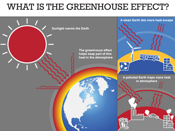
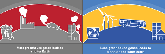
In essence, greenhouse gases are like a blanket around the Earth. They trap heat from the sun, keeping our planet warm enough to support life. However, when there are too many greenhouse gases, it's like adding extra blankets, making the Earth too warm, and leading to positive/negative feedback loops in our Earth’s climate system.
At its core, the challenge of greenhouse gas emissions is complex and far-reaching, spanning multiple sectors of human activity, from energy production and transportation to agriculture and industry. Beyond mere temperature rises, the consequences of unchecked emissions encompass a wide array of ecological disruptions, including altered weather patterns, rising sea levels, biodiversity loss, and an increase in extreme weather events—threatening ecosystems and human societies alike.
Up until the late 20th century, not much was known about anthropogenic climate change – which is climate change caused by human beings. However, over the last 20 years, scientists have studied in detail how human developments such as industrialization, manufacturing, and globalization have impacted the climate system. The Intergovernmental Panel on Climate Change’s (IPCC) first assessment report in 1990 highlighted the influence of human activities, particularly the burning of fossil fuels, on the Earth's climate.
One of the key findings of the latest IPCC report was the confirmation that human activities have caused significant warming of the planet. The report states that global warming is likely to exceed 1.5 degrees Celsius above pre-industrial levels in the coming decades, possibly as early as the 2030s, under current emission trajectories. This threshold of 1.5 degrees Celsius is considered a critical target for avoiding the most severe impacts of climate change.
Technical Summary
I have always been fascinated with the intricacies of our Earth’s climate system and how the synchronization of multiple forces of nature dictates seasons, weather and natural disasters. This project provided the perfect opportunity to combine my passion for studying the impacts of climate change and my skillset in data analytics.
Throughout this project, I utilize key Python data analytics libraries such as pandas and numpy to clean, organize and transform the dataset; and data visualization libraries such as matplotlib, seaborn and squarify to bring to life key insights within the dataset.
All the above transformations and analytics were converted into a Tableau-friendly csv file to be used in creating a greenhouse gas emissions dashboard that at a glance provides country and industry-wise emissions details.
Setup
Importing Libraries
The pandas and numpy libraries will be used to read, organize, and transform our data for analysis, while matplotlib, seaborn and squarify will be used to visualize our data points for additional insights.

Information about the dataset
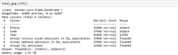
The dataset used in this analysis was obtained from ourworldindata.org and contains four csv files. Our largest file contains total emissions data by country (1850-2021) and by type of GHG (Carbon Dioxide, Nitrogen, Methane), and contains 41968 rows and 6 columns. The remaining three files contain emissions data broken down by industry and country (1990-2021) for each of the GHG’s. They contain 6355 rows of data and at least 7 columns, each.
Data Cleaning
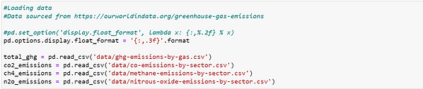
We assign total emissions data to the dataframe total_ghg and industry wise emissions data to the dataframes co2_emissions, ch4_emissions, n2o_emissions. The default display option for floating point numbers is set to 3 decimal places.
This study will only focus on emissions data from the most recent decade (2010-2020). Filtering all dataframes to years between 2010 and 2020. [Note: since most of the data cleaning operations are being applied to all 4 dataframes, to simplify the code, dataframes are placed in a list df_list before looping through the below operations.]
The dataset also contains sub-total and aggregated rows for region and continent-wise emissions data. These datapoints will not be used in the analysis and can be dropped from the dataframes.
To simplify working with the columns in the dataframes, we rename the original columns to remove any scientific notation as well as introduce shortforms for the GHG’s.

It is important to ensure that there are no NULL values in our dataset. Let’s check for NULL values and replace these values with zero.


Data Transformation & Data Visualization
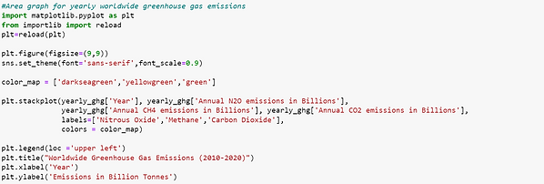
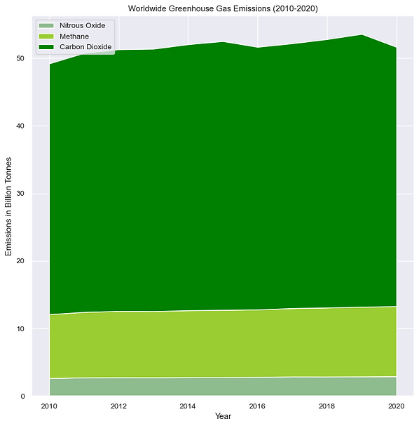
Worldwide Greenhouse Gas Emissions
To graph total greenhouse gas emissions by year, the pandas library's groupby() method is utilized to group the data by year. This involves specifying the N2O, CH4, and CO2 emission columns for aggregation. Emission values, typically in billions, are scaled by dividing each column by 1,000,000,000 (37,000,000,000 --> 37 billion).
The matplotlib.pyplot library's stackplot function is employed to visualize the data. The X-axis represents years, while the Y-axis shows emissions for each greenhouse gas.

Top 10 Emitting Countries (2010 - 2020)
To visualize the top 10 emitting countries, the dataframe must first be updated to include a total emissions column for each GHG. For example, the total CO2 emissions can be computed by summing the emissions from various industry sectors (transport, manufacturing, energy, etc).
Subsequently, the dataframe can be grouped by the country (specified under 'Entity') column and aggregated based on the newly added total emissions column, denoted as co2_country. The objective is to focus solely on the top 10 emitting countries, thus the values in co2_country are sorted in descending order and limited to the top 10 rows.
Finally, the data can be visualized using the treemap option provided by Plotly Express, which offers an effective means to represent hierarchical data.


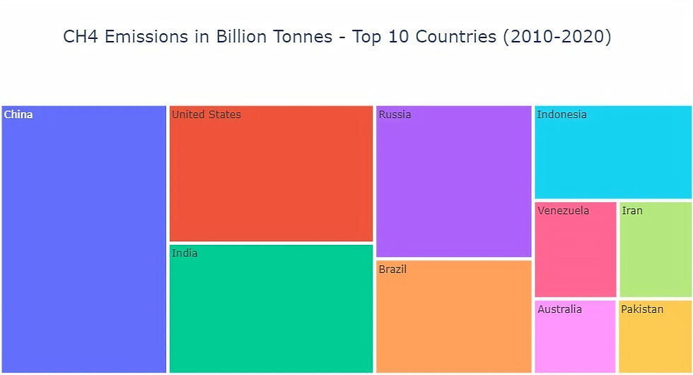

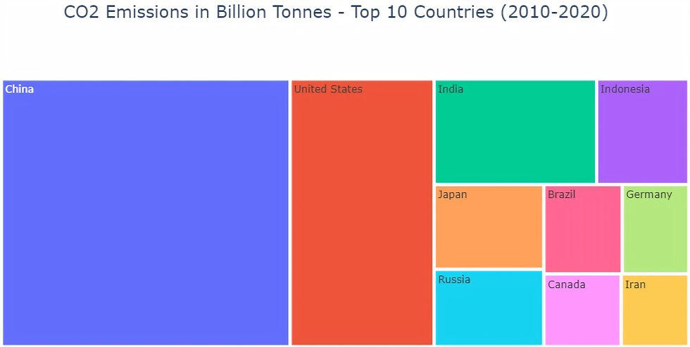
NOTE: Scroll through the gallery to view graphs for each GHG.
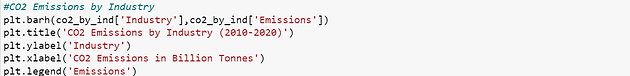
Top Emitting Industries (2010 - 2020)
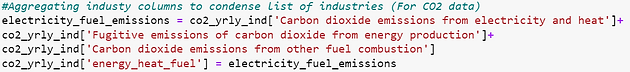
Before plotting the emissions by industry, it's essential to combine certain industry columns into broader categories. This consolidation helps streamline the list of industries to be visualized. For instance, we can create an energy_heat_fuel column by summing up emissions from multiple related industries.
Additionally, to enhance readability and ease of use, column names can be renamed to remove redundancies. For example, all column names starting with Carbon Dioxide from industry can have this prefix removed. Furthermore, we can drop the columns that were used to create the energy_heat_fuel column. A new dataframe can then be created, listing the industries and the sum of emissions from each industry.
Finally, the emissions can be visualized using a simple horizontal bar graph implemented with matplotlib.


NOTE: Scroll through the gallery to view graphs for each GHG.
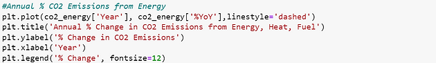
Emissions Growth in Top Emitting Industry (2010 - 2020)
To examine the growth rate of the top emitting industries for each GHG, we can create a condensed dataframe comprising the Year, Total emissions from the largest industry by emissions, and Percent Change columns. The percent change can be computed using the .pct_change() method available in pandas.
Once the dataframe is prepared, a line plot can be generated using matplotlib. The Year will be represented on the X-axis, while the percent change will be displayed on the Y-axis. This visualization will provide insights into the fluctuation of emissions from the top industries over time.


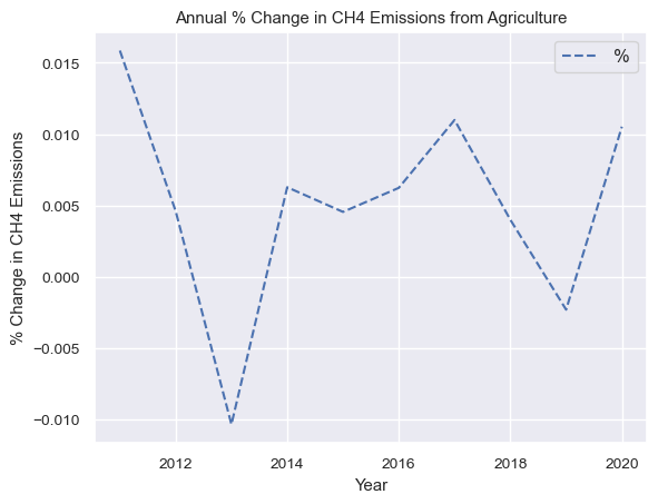

NOTE: Scroll through the gallery to view graphs for each GHG.
Data Extraction
Dataset File Structure
The dataset consists of several CSV files structured as follows:
-
One CSV file contains annual greenhouse gas (GHG) emissions, categorized by country and year.
-
Additionally, there are three separate CSV files, each focusing on annual GHG emissions from individual industries, also categorized by country and year. These files are specific to CO2, CH4, and N2O emissions respectively.

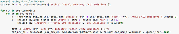
Adjustments for Tableau
To ensure that Tableau plotting is accurate, there are a few changes that are required to the structure of the data:
-
Currently the data is pivoted in all csv’s with annual emissions structured as columns instead of rows. This complicates the task of Tableau plotting and integration. To work around this, the data must be un-pivoted using Panda’s .melt () method.


-
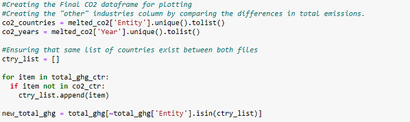
Given that the first file contains total emissions by GHG while the other files contain emissions broken down by industry, we need to compare the sum of emissions from all industries with the total emissions file.
-
If the total emissions exceed the sum of industry emissions, we attribute the excess emissions to "other" industry emissions in our final data export.
-
If the total emissions are less than the sum of industry emissions, we attribute zero emissions to "other" industries in our final data export, indicating a likely discrepancy in data collection.
-
-
Subsequently, all required data for plotting is consolidated into a new dataframe and exported as separate CSV files for each GHG. This processed data is now suitable for integration into Tableau.

Tableau Dashboard
Husain Miyala